Thursday, June 9, 2011

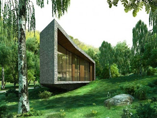
Over in Mexico


(I apologize for the absence of posts and updates. I have been away from electronics for a while. By the way if you want to see new products concepts and designs over architecture, please let me know. I enjoy both, but I'd rather have it consistent then not.)

This place is pretty nice, contemporary inside and out. Sadly it is located near an area, south of Mexico City, which isn't the most pleasant of places to be by. Considering its high crime rate at the moment. But then again, it is located outside of Mexico City. If you want more valuable information I recommend checking out the architecto's website.

Tuesday, April 19, 2011

Japan, oh how i love thee


Japan has some of the most interesting homes, mostly because there is no room for anything. You get a lot of these square homes, a lot of prefab, and definitely when you're walking around with a map to the address you need to be at, you'll run into these beautiful (I use this word sparingly) homes. It's just awesome how out of the ordinary this place is. In the states homes are to be huge and intricate...Japan though, things have to be pretty small and minimal...AND work!
Half the time in Europe though, the building are all attached. One huge block of building over separated homes. So the Japanese manner of building homes actually attracts me quite a bit. Maybe I'll find some more :)

Source: Reflection of Mineral Home

Thursday, April 14, 2011

A little water from Italy


This Casa Masso by Marco Castelletti is a very elegant match to the lakeside water body it sits by. The rooms are spacious enough it seems, and the openings + windows have such a gorgeous view of the land. If I could have a summer home, I would definitely pick this.

Source: Marco Castelletti

Monday, April 11, 2011

A little something from My Teacher


So having studied Graphical Design and Industrial Design, and always following up on as much as I can from my professors. I found out one of my very loved (Scott Wilson) mentors helped in creative design of the X-Box Kinect.

Single Family Home in Varna


The Architecture Group Dizarh a single family home, and to my knowledge, without a name, to blend in with the wooded area is was built in. It's quite refreshing to see this type of building as opposed to my ever-so-loving box homes.

Source: Dizarh

Friday, April 8, 2011

Boh Tea Centre


This Tea Center is great. It's long and overhanging (I like this quality in architecture :), with a tremendously gorgeous view. The ZLG design group really worked well on this one.

Source: ZLG Design Group

Wednesday, April 6, 2011

Let's Take it Back to 1975


Here is a small series of stamps created by Israeli designer Eliezer Weishoff in about 1975. It's a great piece of graphical design, with in which if I were buying stamps would love to have these. I wish more graphic designers would do this (come to think of it, maybe I'll try my hand in making them. :)
BTW these stamps also talk about the environmental problems and hazards almost everyone endures everyday. And with a little bit of home, shows a bit of a better solution or care to the problem.

{SOURCE} Courtesy of Richard at Ace Jet 170

Damiano House


This home was created by the Tres Birds Workshop, for the Damianos'. When conceptualizing this project, the Damianos' wished for a home that would surpass 400 years of life. Now I don't know if it will stand that long, but I am sure as eco-friendly as it is (It runs on full support of Solar energe, even though it's in Colorado, and they family is a winter loving family) it will last their lifetime.

Source: Tres Birds WorkShop

Saturday, April 2, 2011

Novartis Campus


Though done by various architects, some of whom are Frank Gehry, Peter Maerkli, and SANAA, this campus feels like a whole. If I were to get my PHD somewhere it would probably be here, thought I've never though to check if they offer anything I would enjoy :)

Source: Phaidon

Friday, April 1, 2011

Barcode House


Located in Munich Germany, this residential house by the MVRDV Architectural group is set up on 2 lots. Its like most box houses in which the structure is squarish but then its protrusions, subtle angles and composition allow it to acquire it's own shape and character. I do love the manner in which box houses always extend beyond its format, including their selective material use/positioning and colour.

Source: MVRDV

Wednesday, March 30, 2011

Meiso No Mori Municipal Funeral Hall


This piece of work was done by the Toyo Ito and Associates Architecture firm in Kakamigahara, Gifu. It's quite an excellent funeral home. Though I don't know specific funeral customs of Japan. I feel a bit sad that such a beautiful thing can hold such sadness inside. {Though I'm sure glee can come from it too}

Source: Toyo Ito and Associates

Lindal Cedar Prefab Homes


A new series of home from Lindal Cedar for the Dwell Turkel Collection.
Source: Lindal Cedar

Monday, March 28, 2011

Rehibiliation Center


Up for the Mies Van Der Rohe Award is this beautifully assembled Rehibilitation Center in a forest located in the Netherlends, by Architectenbureau Koen van Velsen.

Source: KoenVanVelsen

Thursday, March 24, 2011

Cemetery Road


The Courtyard view is drastically different from the front, roadside, view. Still the apartment complex has shape and character. I wouldn't mind living in this place...Well unless it was overpriced for its design.

Small House


A Small Modern House (seems to have elements of the Prairie Style, but those long overhanging ceilings seem to be showing up everywhere.) by the Cooper Joseph Studio.

Wednesday, March 23, 2011

Orange House


Sweet Orange SUPER protruding House. From Architects Nuno Grande and Pedro Gadanho.

Friday, March 18, 2011

Thursday, March 17, 2011

Residental Architecture


Architecture work from Marmol Radziner for the Vienna Way Resident. It's quite nice :)

Wednesday, March 16, 2011

Iron Concept Design


Russell Blanchart's iron design for Philips. It's pretty sleek and if it worked well and was on the market, I probably would buy it myself. I love the curves and lines.

Tuesday, March 15, 2011

Joseph Walsh's Formations Chair


Joseph Walsh is very developed when it comes to Designing in Wood. He can curve and contort the material so well you think it was plastic molded wood. It's amazing. His chair is very curvilinear, and though I've never tried {in which I wish I could} it is a very ergonomic looking chair. Cheers!

Monday, March 14, 2011

FMG9


The FMG9 is a Super Compact "Rifle" concept.
I think it's based on a 9mm so it may be considered a sub machine gun because of its sights and physical look and design, or maybe just a pistol because of the model it's designed off of. Either way it's the coolest flashlight I could ever own :)

Monday, March 7, 2011

Maison L


Christian Pottgeisser's Maison L private home for a family of six.
It looks like a whole bunch of Rectangular Prisms erected randomly on some land, but it's quite complicated inside.
Source: Pottgeisser

Saturday, March 5, 2011

Josh Brill Birds


Josh Brill does some pretty neat graphical Design with his birds.
I'm not sure the reason for all of this but I think it looks great.

Thursday, March 3, 2011

JAQK Wine Package Design


JAQK wine package and label design is what good Graphic design is made of. Witty name, Great logo, Fun packaging, what else could you ask for? (probably the great wine part :)
Source: JAQK

Tuesday, March 1, 2011

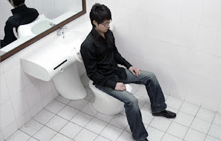
Universal Toilet Design


This is a pretty neat concept for a universal (or limited ability) toilet.
By designers Changduk Kim and Youngki Hong
Source: Yanko Design

Monday, February 28, 2011

Mazda Furai Concept Car


Mazda's Not so new Concept car also known as the Furai.
Source: Wikipedia

Saturday, February 26, 2011

Huck Gee Dunny


This guys Dunnys are pretty fun to look at, and if you're into Pop Art, he's a fair player in the game. I enjoy most of his works.
Source: Huck Gee

Ro-Ro Rocking Chair for Zilio A&C


I like the new manner of making a rocking chair by TNA Design Studio. It comes in brown as well. I'm sure they go for a pretty penny.